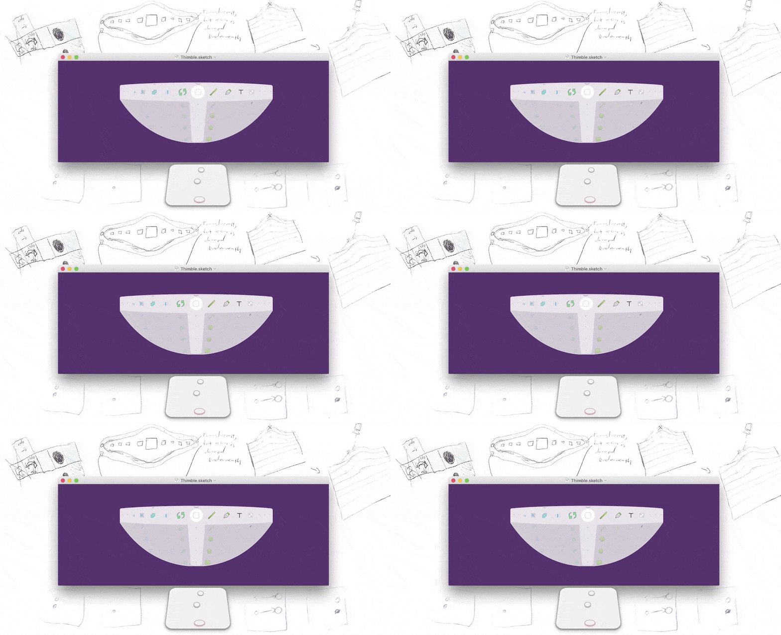
It’s been a while since writing on here, is this microphone still on? The past few years I’ve been spending my spare time on a mac app - specifically a multi-touch gesture to make using design tools like Sketch, Photoshop, and SketchUp faster. If this sounds like something up your alley go sign up at thimblemac.com first, I’ll wait for you :).
Back? Okay, let’s dive into how on earth I made this thing.
Discovering Touch
I started thinking about this around the summer of 2012. I finally switched to a mac a couple years earlier and was always impressed at how the trackpad worked compared to anything else - from the glass surface to how it detected resting thumbs and palms.
Gainfully unemployed that summer, I finally had time to learn Objective-C and play with ideas. There were already apps that let you create gesture shortcuts from drawing characters or finger taps, but they felt like a burden to customize and remember. Instead I wanted to pair a single gesture with a complementing interface instead. The gesture in mind was combining a resting thumb on the trackpad with scroll to select, simple as long as there’s some processing to ensure it doesn’t conflict with normal scrolling or other gestures.
As far as ideas using the gesture, the first was a faster way to switch between application windows:
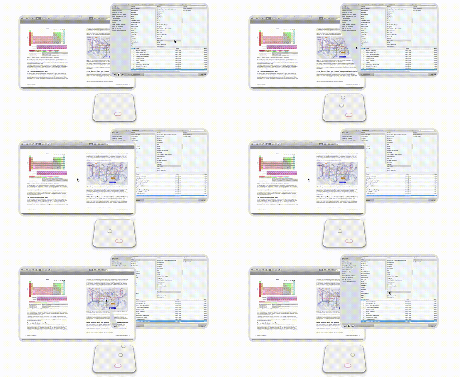
Between having none of my friends try my demo and feeling like it wasn’t a big enough pain, I talked myself out of this idea pretty quickly. Simultaneously though, I was working on a web startup and found making tweaks to graphics to be tedious - especially when cramped at a tiny coffee shop table without my mouse. After talking to a graphic designer that saw the same frustrations, I set off on making another prototype.
Thimble’s First Prototype
During the winter of 2013 I made another quick prototype - this time the gesture repurposed for selecting tools within Illustrator.
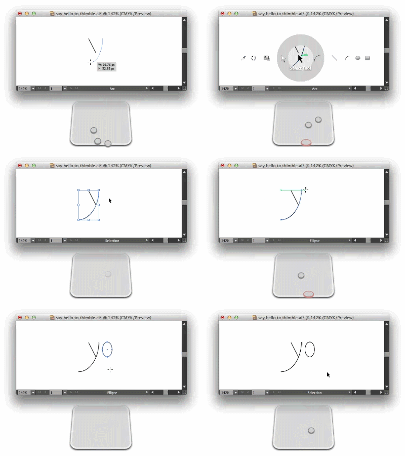
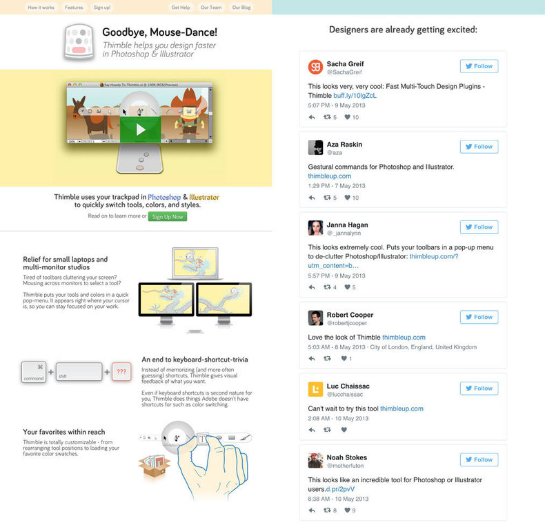
It was crude, but good enough to get interest at some small design shops and motivate myself to build a teaser site. Without much marketing beyond a reddit post, it lead to some notable tweets and nearly a couple hundred signups. Not quite enough to quit my dayjob, but enough to stay motivated to continue working on it.
I thought I could just fix a few things and ‘ship it’, but the app had plenty of bugs. Most scary was a seemingly unsolveable one where calling the Illustrator API would hard-crash Illustrator at random times and cause users to lose work. So I took a break for a while then restructured Thimble to support multiple apps, starting with Photoshop. Eventually it got to a point where I was ready to redesign the interface.
Redesigning Thimble
The prototype interface had a lot of issues - it only supported a single row of tools, which couldn’t hold enough things to let you entirely avoid an app’s toolbar. The interface’s main class was an 800+ line ‘massive view controller’ where the icon positions followed a wacky spacing algorithm rather than a simple Gaussian function. Finally, it looked hilariously dated in a post-Yosemite macOS world, where ‘vibrancy’ (i.e. blurred transparency) started overtaking greys and gradients. So it was time to scrap it and start anew. I started by plotting gaussian equations in a jupyter python notebook, then migrated to coding the real interface with a separate ‘designer’ build.
![]()
Once I got a decent outline of the new interface figured out, I started diving into making the selection mechanism feel more intuitive.
The tool selection ‘blob’:

Some of the complaints with the first prototype was that there needed to be some better indication when selecting items. At the time the only indication was the selection text change. I initially played with some simple ideas like alternating a background color but it didn’t feel right. Inspired a bit by the Google’s material design, I came up with an amorphous blob stretching and jumping to the selected item. This involved a bit of learning with CAShapeLayer in terms of preserving the point order between different change directions, but am happy with the result.
The column selector:
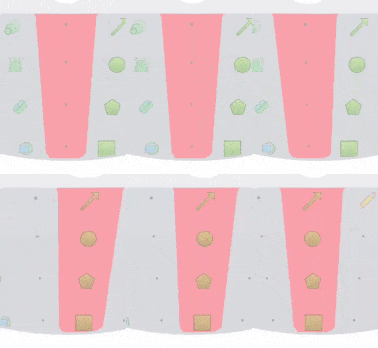
Having a column selector at first seemed like a simple affair, just have a long trapezoid-ish object stretch and move like the selector with horizontal movement. But things didn’t feel right without having rounded corners on the column selector. To do this right though, the corners on the selector have to move both along the curve of the row selector and the bottom edge curve of the whole interface. To interactively trace along curves without learning bezier math, I came up with a hack called CGPathQuery that does work on a hidden graphics context to find points along the curve.
The column hidden icon indicator:
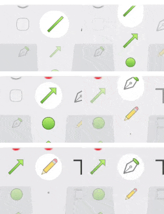
Maybe I went too far, but one little thing that bothered me was not having some visual indicator to show when icons were hidden after scrolling up a column. So I added some subtle dot indicators that, through CGPathQuery, traverse along the top edge when scrolling horizontally.
Filler Dots

The little grey dots aren’t there to indicate missing icons, they’re there just for aesthetic reasons. Without them the interface doesn’t quite hold it’s form together - especially when scrolling on the first or last column.
Scroll direction locking between ‘gesture pauses’
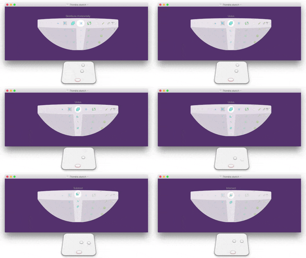
I didn’t want some type of freeform scroll akin to the Apple Watch homescreen, which meant I needed a way to ‘lock’ onto either the horizontal or vertical scroll direction. Basically when the gesture starts (or after a pause), the scrolling direction locks to whatever direction you start scrolling in until the gesture pauses or ends. The other thing that happens upon a gesture pause is that the selected tool gets recentered.
Learning Thimble (a.k.a. The First Run User Experience)

From watching people use Thimble, it’s proven to be a gesture that seems really non-obvious at first, but with a bit of hand-holding and practice it starts to make sense. But I can’t personally help every user. So to help users practice I wrote a small wizard that pops-up on the first run and gives the user a chance to practice the gesture first. The wizard also takes care of some other housekeeping from guiding the user to enable accessibility permissions to scanning for supported apps. The underlying navigation code of the wizard is available here.
Coding it all together
I followed a Model-View-ViewModel structure when redoing the interface - where I usually had ViewModel files containing state then the ViewController/View files containing the stateless rendering functions. This enabled me to have tests written against some of the UI math contained in viewmodels, and have better organization for different aspects driven by a shared viewmodel. I also used ReactiveCocoa to try expressing the gesture events through interface changes as signals over time. More specifics on my ReactiveCocoa usage is in the ‘lessons learned’ part of my xcoders talk.
I regret not rewriting the interface in Swift, but at the time Swift 2 wasn’t out yet and ReactiveCocoa Swift support was experimental. Plus, my mind was burdened more with wrapping itself around the reactive paradigms and seeing something work. There’s still a ton of other things that I’m not going to bother diving into, but for a fun run-on sentence some of the other work involves hiding (and unhiding) the mouse, changing the render setup when switching between non-retina and retina displays, sniffing packets under wireshark to find a bug in the Photoshop Server sample code, hacks to ensure menu selection via accessibility api works correctly, learning things from iOS Core Animation - Advanced Techniques to make everything work at 60fps, yadda yadda yadda…
What’s next?
This week, I’m shipping the beta to a small group of testers. As long as there’s no explosions there will be a wider beta release soon. I definately have plenty of concerns with whether there’s still interest in Thimble due to my own lack of marketing the product. Furthermore the rumor that the new macbook keyboards will have an top row on-screen display for QuickType and app/context-specific buttons seems highly plausible. Right now though, Thimble’s still something I find myself using, and hopefully others want it too. If you’ve made it this far and haven’t signed up yet, well sign up right here.
Extra Bits

I’m frankly embarrassed at how long Thimble took to develop, but it was a spare time sideproject. There were plenty of times where I got demotivated and either took a break or started tinkering with other projects. There were also times where I simply got too busy with my dayjob, but it was really hard to justify Thimble as a full-time startup or as some type of crowdfunded affair. There’s arguably some areas where I could’ve reduced scope such as supporting less applications, or not having a preferences backend. I’ve never spent this long on a personal project in my life though, so I’m surprised development made it this far. During my most productive periods, my routine was an act of working for the dayjob (remotely) in the morning and afternoon, a context switch of working out, then walking to the library, coffee shop, or NSCoderNight to work.